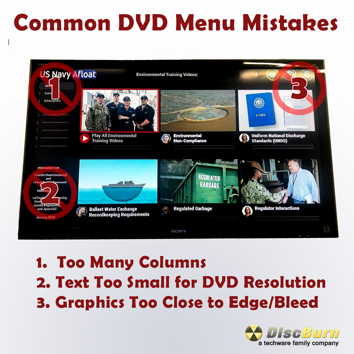
- Limit the amount of visual column in your DVD Menu Screen. Crowded design causes legibility issues and navigation issues with some television remotes.
- DVD Menu Screens are 480p resolution. Fonts with Serifs will often look muddy or unprofessional. Make sure to utilize large fonts with bold san-serif styles in your DVD menu design. Impact is a good font.
- how close you put your visual content to the edge (bleed). Different DVD players and Televisions have different amounts of cropping and scaling issues that can cause problems displaying graphics or text near the edge of the DVD Menu Screen.
With these three simple tips you can make your next DVD Menu more user friendly and Professional. If you would like any help with DVD Authoring, Mastering or Menu creation don’t hesitate to contact us at 612-782-8200.